Alerts
Alert is an message used to attract users attention and give important information about the user's action
Basic alerts
These are alerts with basic style and functionalities
Closable alert
This is the alert with closing functionality
Outlined alert
These are the alerts which are containing specific coloured borders
Link alert
These are the alerts which are containing links to deal with the error or required action for the alert
Avatars
Avatar is an icon which shows the users profile picture, This is displayed specific to the account. Normally for any accounts created if there is no any picture provided then automatically Text based icon will be displayed and if picture provided then that will be displayed
Round Image Avatars
These are different sized round shaped image avatars, different sizes of avatars large(sm), medium(md), small(sm) and extra-small(xs) sizes
Round Text Avatars
These are different sized round shaped text avatars, different sizes of avatars large(sm), medium(md), small(sm) and extra-small(xs) sizes
Square Image Avatars
These are different sized square shaped image avatars, different sizes of avatars large(sm), medium(md), small(sm) and extra-small(xs) sizes
Square Text Avatars
These are different sized square shaped text avatars, different sizes of avatars large(sm), medium(md), small(sm) and extra-small(xs) sizes
Badges
Badge is a component used to give information about the state. There are different types of badges in online store badges used to give information about new arrivals, In social media applications it is used to provide information about status of user and it is also used to provide information of number of items or messages
Badge on Avatars
These are the different types of badges on different sized avatars, They are categorized as available(green), busy(red) and not avilable(orange)
Badge on Icons
These are badges for icons, which is used to give information about the count of messages or state of icon
Text badges
These are text badges which are resized based on the type of text
Demo for Heading with Badge New
Demo for Heading with Badge New
Demo for Heading with Badge New
Demo for Heading with Badge New
Demo for Heading with Badge New
Demo for Heading with Badge New
Demo for Paragraph with Badge New
Ribbon badges
These are ribbon badges normally used on ecommerce products
Buttons
Button is a basic component for website, there are different types buttons existing. few of the types are Primary button with background color, Button with outline, Button with only icon, Button with text and icon, Diabled button, Button with link to specific part or different website, Toggle button and Floating Action button
Solid buttons
These are the buttons having solid background color
Outlined buttons
These are the buttons having outline with specific color
Icon buttons
These are the buttons having just the icon, on clicking that specified action will happen
Button with icon and label
These are the buttons having icon along with label, on clicking that specified action will happen
Link button
This is the button having link to specific section of website or to different website
Toggle button
Toggle button is the one used to switch between any two states
Floating Action button
Floating action button is used to perform most common action on the screen
Cards
Card is one of the important component for ecommerce websites and social media, There are diffent types of cards based on styles. Few of them are vertical cards, horizontal cards, Cards with badge, Cards with dismiss button, Text cards and cards with text overlay
Simple card
Simple card is the basic version of the card containing required details about the product, this one is designed in vertical style
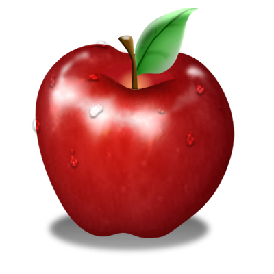
Apple
Fresh apple from farm
Rs.120 Rs.15020% off
Card with badge
This is the version of card which is having badge to attract user's attention towards product
Apple
Fresh apple from farm
Rs.120 Rs.15020% off
Dismissable Card
This version of card is having dismiss action badge to close the card
Apple
Fresh apple from farm
Rs.120 Rs.15020% off
Card with text overlay
This is the version of card having text on the image and also overlay text used to give information of unavailability
Apple
Fresh apple from farm
Rs.120 Rs.15020% off
Rs.120 Rs.15020% off
Horizontal Card
This is horizontal card where data is provided in horizontal direction
Apple
Fresh apple from farm
Rs.120 Rs.15020% off
Text Card
Text card is the one widely used in the places where text is the main content for displaying information
Apple
Fresh apple from farm
Rs.120 Rs.15020% off
Text Heading
This is text card used to display the text paragraph in the card Lorem Ipsum is simply dummy text of the printing and typesetting industry. Lorem Ipsum has been the industry's standard dummy text ever since the 1500s, when an unknown printer took a galley of type and scrambled it to make a type specimen book.
Image
In this library there are 3 variant of images first one is responsive image, round shaped image and square shaped border curved image style
Responsive image
Round shaped image
Square shaped image
Input
Input componenent is the one which is used for taking input from user for different types of forms, some input fields take just text and do processing and also some forms takes input and does processing to check the input value
Simple input fields
These are the one which don't have any extra styling for input fields, either with simple border or with an underline for input
Labeled input fields
These are the inputs provided with label about kind of input expected in the field
Input field with icon
These are the input fields having icon either as button or just an icon for display, Also error styles provided for the form input fields
Text area input
This is the input type used in social media kind of platform or where it is required to give huge amount of text
Chip
Chip is the one small component which is basically used to filter or to enter information
Basic chip
This is the basic version of chip which contains just a text
Chip with close button
This is the basic version of chip which contains just text and close button with that
Chip with icon
This is the version of chip which contains icon on left side and close button on right side
John Doe
×
Snackbar
Snackbar is the one which tells user about what action happened or what action will be performed
Basic Snackbar
This is the one which is normally used in websites to give information about the action, this is used in two forms 1.Baseline snackbar where it is displayed at the bottom of the screen 2.Leading snackbar where it is displayed at the left corner of the screen
Stacked Snackbar
This is the version of snackbar where information is stacked one above the other
Typography
Typography is the text styling component used to provide different styling based on the requirement
Headings
Mainly there are 6 types of headings they can be used either by using tags or by using class names
H1. Heading
H2. Heading
H3. Heading
H4. Heading
H5. Heading
H6. Heading
Using class names for heading
H1. Heading for paragraph tag
H3. Heading for span tag
Different sized texts
Texts of different sizes like xs, sm, md, lg, xl, 2xl, 3xl, 4xl
xs Text size checking
sm Text size checking
md Text size checking
lg Text size checking
xl Text size checking
2xl Text size checking
3xl Text size checking
4xl Text size checking
Grey colored text and aligned texts
These are the text which are having grey color and left, right and center aligned texts
grey colored text
Left, right and center aligned texts
Text center
Text left
Text right
Special styled texts
These are few special styled texts like striked, overlined, underlined, primary colored etc
Striked text
Primary colored text
Overlined text
Underlined text
Bold text
Rating
Rating is the one componet mainly used in ecommerce websites, to asses the quality
Javascript code
Modal
Modal is one of the component which get's popped up on clicking with some importatant message
Modal header
Javascript code
Simplified Grid
CSS grid layout is used to structure the content of page. We can structure the grid based on requirement, here in this library there are 7 types of grid classes
Lists
List is used to display items in different styles like bullet, square, disc, alphabet and number
Unordered Lists
These are the list styles where there is no order for listing, this category have bullet, disc, square as list styles
- Item-1
- Item-2
- Item-3
- Item-1
- Item-2
- Item-3
- Item-1
- Item-2
- Item-3
Ordered Lists
These are the list styles where order is used for listing, this category have numbers and alphabets as styles and it can also be reverse
- Item-1
- Item-2
- Item-3
- Item-1
- Item-2
- Item-3
- Item-1
- Item-2
- Item-3
- Item-1
- Item-2
- Item-3
- Item-1
- Item-2
- Item-3
- Item-1
- Item-2
- Item-3
Input list
This is the one where input items displayed in list style
Stacked list
Normally this kind of list is used for notification display purposes, here lists are stacked one upon the other
- Notification-1
- Notification-2
- Notification-3
- Notification-4
Slider
Slider is used for filtering items based on requirement
Simple price slider is shown here
Javascript code